3/27/20 8:00 AM

Welcome heroes and villains to our first Birds of Prey Dev Diary. The new episode launches April 16, 2020, so it is time to share what’s ahead.
Today we are here with dev and artist Megan “Megzilla” Cheever to pull back the curtain on how we go about creating the “key art” or promotional art you see with each new episode. Enjoy!
Let’s start with the basics. What is your role here on the DCUO team and how long have you been at it?
I’m the 2D Artist for DCUO – I handle concepts for our gear suits, our UI (such as the icons and menus), texture support for our environment artists, emblems, and I help out with marketing art - which includes key art! I’ve been helping design for DCUO for about 4.5 years now.
What does it mean to be a 2D Artist? What things do we see that you make?
For concept art, I help give a road map for our 3D artists (character and environment) to help visualize what a prop or gear suit would look like. My job there is to solve any discrepancies between a comic book suit and how our styles are broken up in the game. Translating a 2D comic into 3D is not always as simple as it might look.
My icons, UI, and texture work are pretty straight forward. Sometimes I’ll help make a pattern or do a monitor screen or a poster. My actual in-game handiwork is emblems that players can wear, and I’ve been doing the key art, or promotional art, for episodes since Deluge in Spring 2018.
What tools or software do you use most?
95% of my work is done in Photoshop. For all the previous key art, the art team would work within our UE3 editor to get our DC characters posed and lit to start off with, though that’s not the case for Birds of Prey.
How did you get into the industry and find yourself at Dimensional Ink?
I went to Academy of Art University for art school, which is in San Francisco. I attended GDC in 2014 on a student pass and made sure to go talk to as many studios as I could. Life happened in such a way where I ended up in Austin, TX and one of the studios I kept in touch with was also located there. I got my foot in the door via an internship there, and by expanding my professional network.
One of my friends presented the knowledge that DCUO was looking for a UI artist, I took an art test, and now I rule the second dimension with an iron fist.
Do you have any advice for folks out there considering a career as an artist in the game industry?
Work hard and network. Educate yourself on what a concept artist or illustrator needs to bring to the table and have examples of that in your portfolio. Be open to feedback and have a growth mindset!
Do you have any advice particularly for women looking to break in?
Same as anyone else – work hard, be passionate. Don’t be afraid to speak up or have a voice.
Okay, let’s talk about key art. First of all, what is it and why do we create it anyway? Don’t just say “marketing.”
I like to think of it as our hype piece! Like a movie poster. Something that gets people curious and excited about our upcoming content. The key art is the centerpiece of the marketing material for our episodes, so it needs to convey an idea of what the episode is about and what the overall mood will be.
For example, our Metal episodes had really dark key art. For Metal Part II, I wanted to convey a feeling similar to a Frank Frazetta painting, utilizing the drama of a hero versus a big bad monster-creature. Our Birds of Prey key art is much different – more of a fun and and light tone. It features some of our key DC characters in a girl-band team-up vibe which helps convey some of idea of our story.
We also use the key art for some of our loading screens and I think that extra reminder of our comic roots is enjoyable for everyone.
It’s episode time and the team needs you to do your magic with key art. What's your first step?
When we are getting ready to start key art work, I like to have a meeting with design, marketing, community, and other stakeholders to discuss what we want to convey. What are the key story points, who are our DC characters, what are we trying to say?
Usually we don’t start this process until we are about a month or two out from releasing the episode, since we were utilizing our in-game models, but for Birds of Prey we went full illustration, so we were able to brainstorm together much earlier. It was a really fun and collaborative process.
How much do you refer to the comics directly in this process?
We rely a lot on our own narrative for the storytelling in the key art. For a couple pieces, we’ve done an homage to other comic book covers to give “our spin” on something we thought was very cool. Our Metal Part I key art took inspiration from DC’s Batman Who Laughs comic book cover, and this Birds of Prey key art is very much inspired by a gorgeous DC Batgirl and the Birds of Prey cover by Kamome Shirahama.
With Birds of Prey, there is a different mood going on. What makes it stand out?
This episode is FUN and features completely new refreshes on our major DC characters – doing a “band” style illustration allows for the piece to focus on the DC characters. It is much more subtle storytelling than something like our Superman vs. Doomsday key art, but we are also telling a different story in this episode. The mood comes across as entirely different, and that's the point.
Can you speak to that tone or vibe you were looking to communicate, about the episode itself?
Light-hearted! Teamwork! Funny! They let me draw Isis chewing on cords. :)
You mentioned the Birds of Prey key art is full illustration, which is different than the way some other key art was done. Can you explain the differences?
All previous key art that I have worked on utilized our 3D models set in our actual environments. There were a lot more hands that touched the art – we had environment artists help with the levels and posing our character artists’ models, we had our animator making specific poses, and then I helped composite and fill in any gaps. There is a lot of collaboration among the different disciplines, which is really rewarding. This also means it gets done much quicker!
In the past, we have also had a couple of amazing DC artists do key art for us (Age of Justice, for example) and I thought those turned out super neat. So this time, I asked if I could do an illustration for Birds of Prey.
A lot of the collaborating was done on the front end so we could hammer out the finer details of the background, the poses, etc. I worked with another concept artist here on the characters themselves, since it is always good to have another set of eyes checking your work. A lot more of my time goes into something like this since everything is handcrafted. I referred to our in-game models for some pose help and used a lot of photo reference as well.
I know getting from blank page to final piece has a lot of steps. Can you walk us through the process, and maybe shows us some of the major work-in-progress versions along the way?
Sure, here goes!

Earliest Thumbnail Sketches Set 1
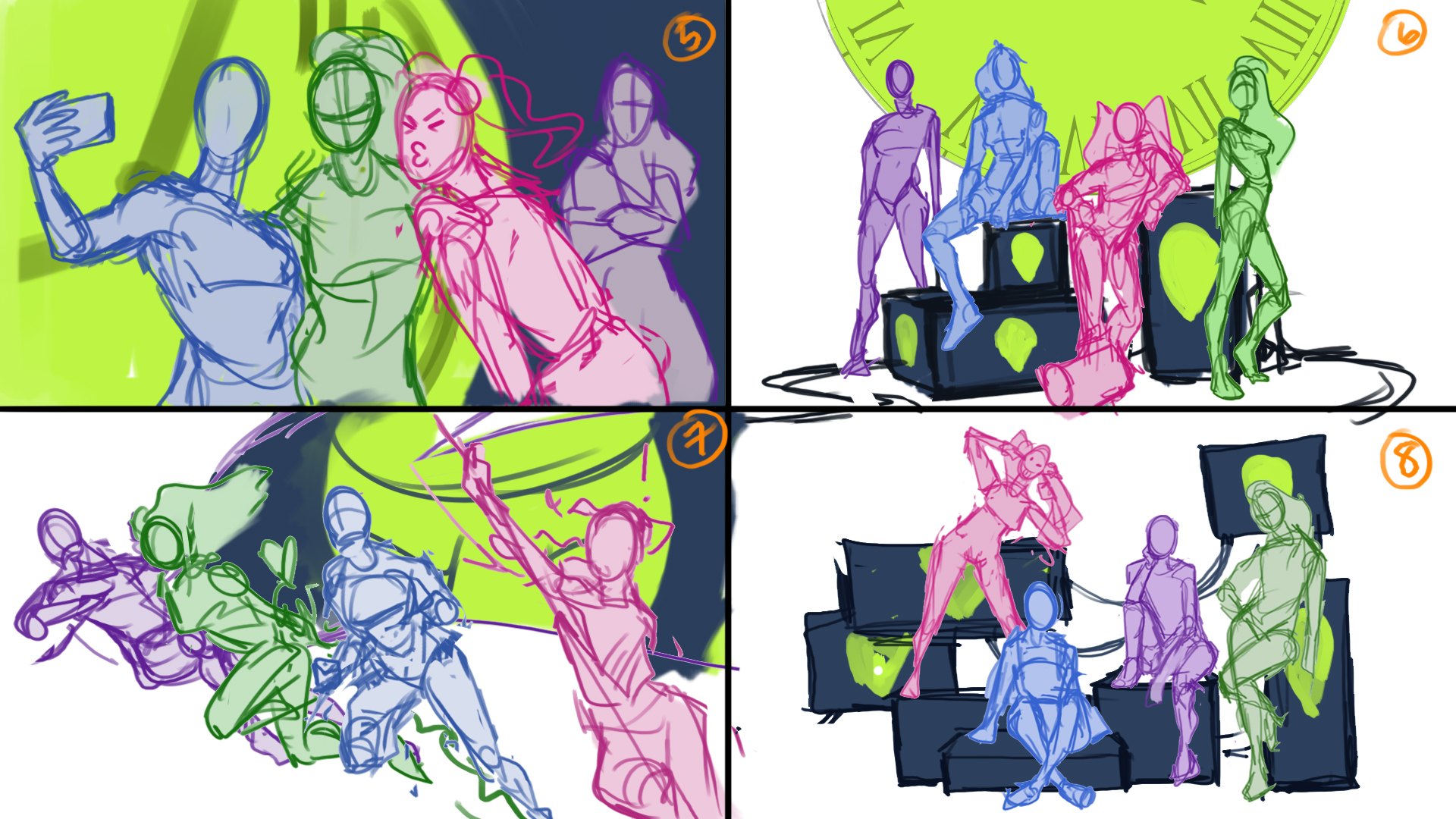
Earliest Thumbnail Sketches Set 2
These were my first batch of thumbnails. I thought it would be cute to explore the selfie idea with this team. I could really ham up Harley with duck face or very expressive posing, and I could lean into Huntress being reluctant and DARK in the background.
It was overall a little too silly for what we wanted for this particular key art. I only had one action sketch since that wasn’t really what we were going for, but I wanted to throw it out there just to see. Since Black Canary is a singer in the comics, I liked the idea of “GIRL BAND” for this set of characters. Using the speakers as the main environment element allowed us to go more pin-up and “graphic design” rather than a literal location.
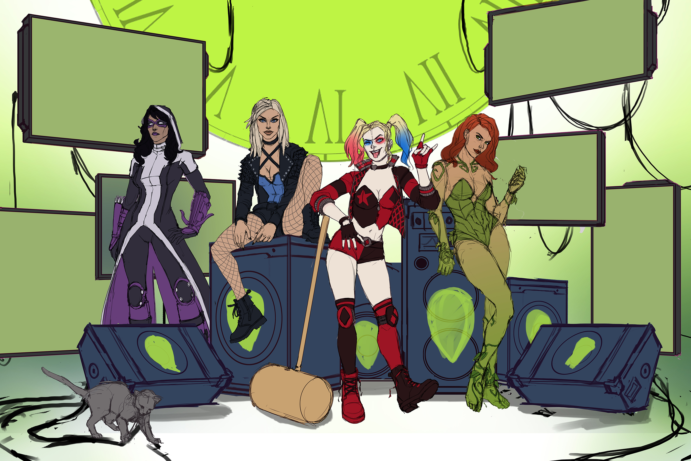
Color Rough
After much discussion, we went with #6 from thumbnails. The next part was for me to flesh out the sketch a little bit and make sure this was really the direction we wanted to go, as well as address any concerns. We liked the monitors from Kamome Shirahama, so I went ahead and composed those here. At this point, we sent this version to DC to get approval with this direction.
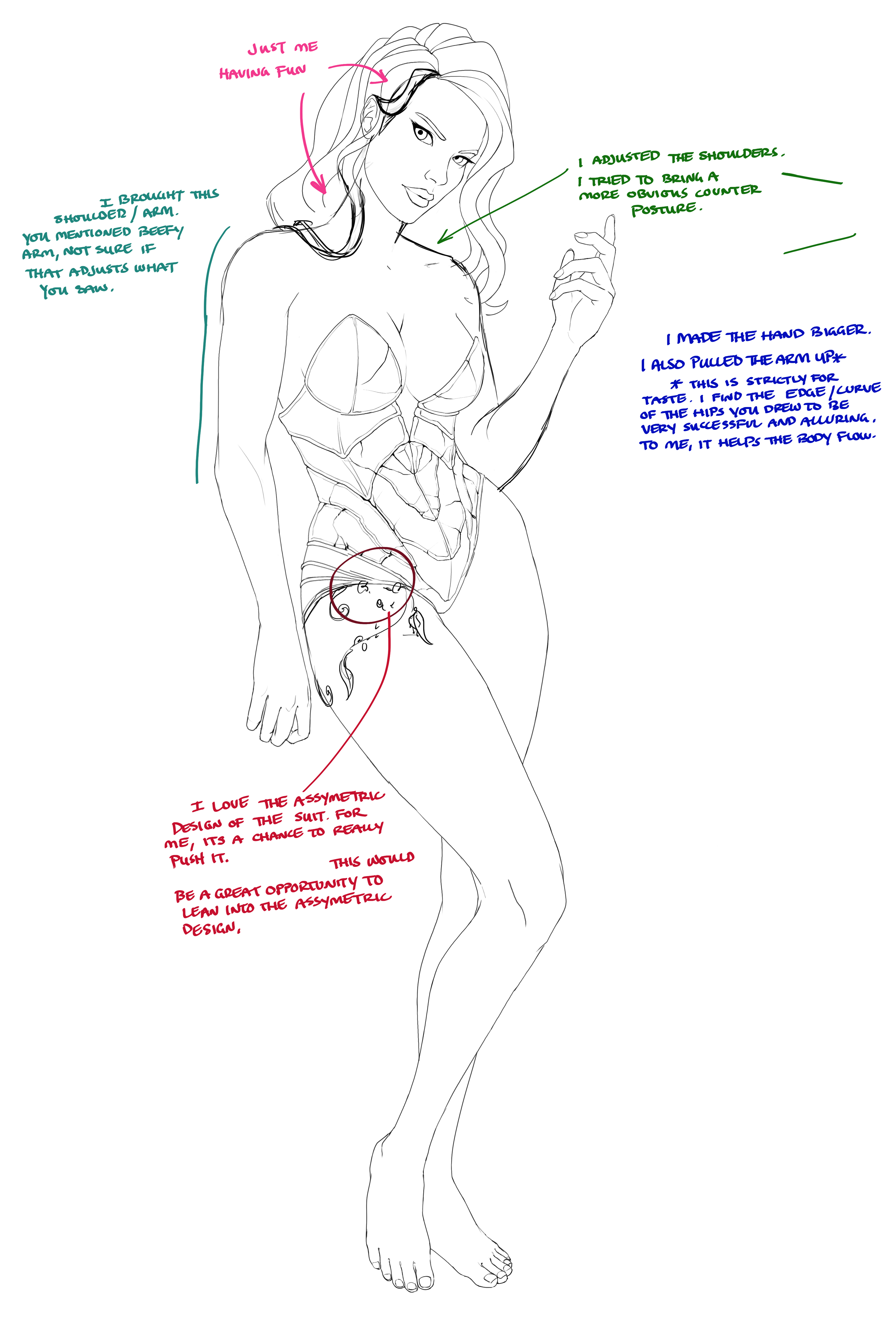
Poison Ivy Sketch with Feedback
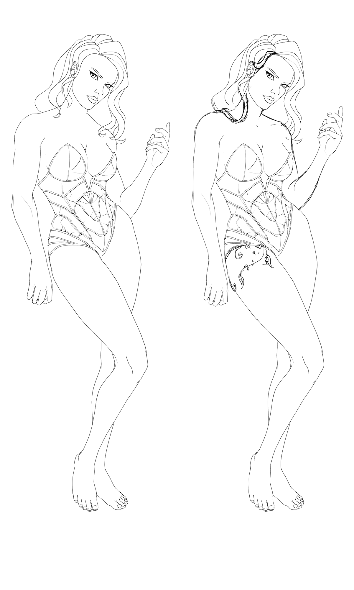
Poison Ivy Variant Sketches
This is an example of me sending my linework to one of the other artists. I sent him WIPs of everyone when I was able – this is a great of example of how small changes can really make the difference. Here I thought Poison Ivy’s shoulders were stronger than I wanted and she was overall a little too “tough” – his changes of softening the shape of the shoulder and for the hair to drape over the ear really helped soften her look.
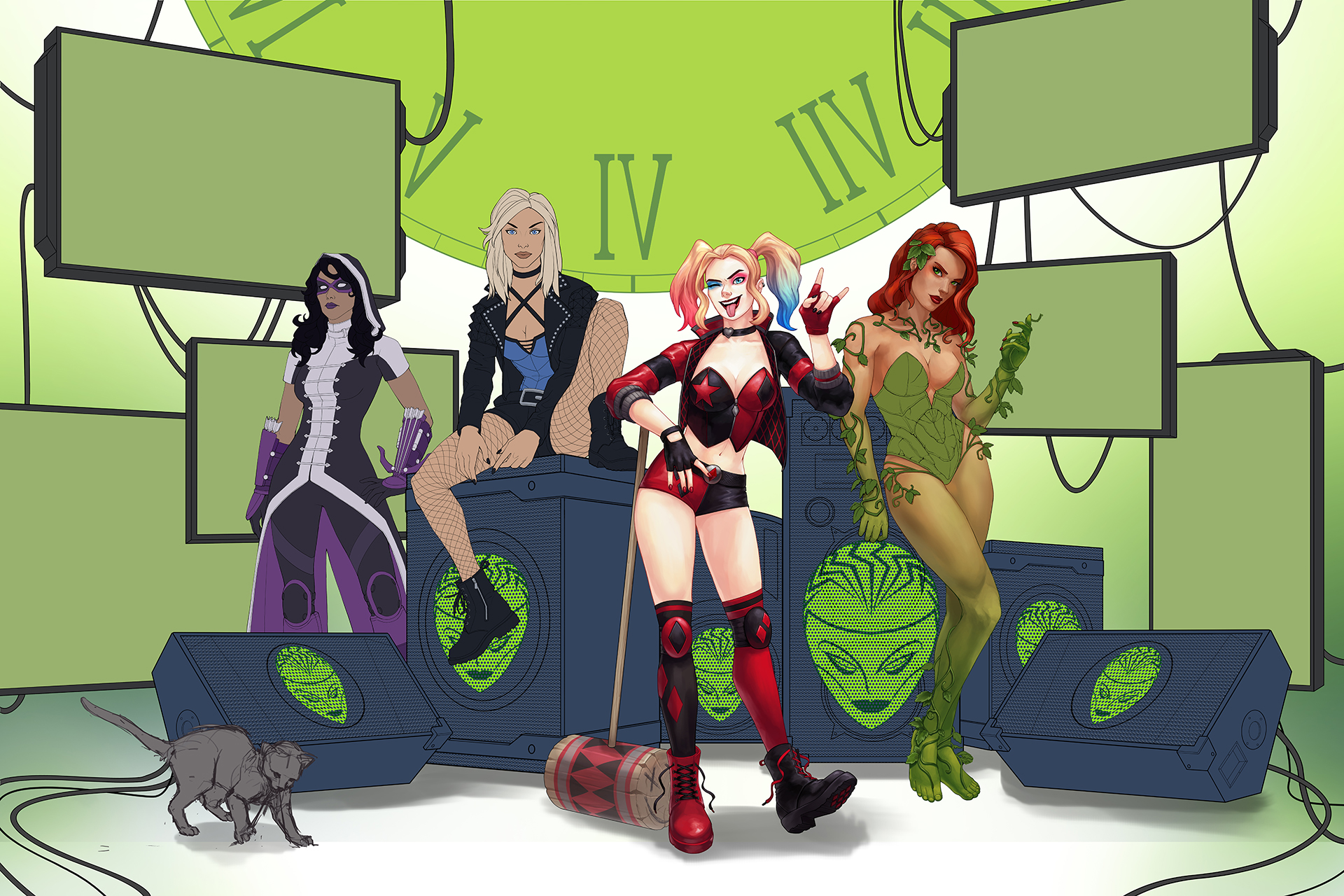
Updated Color Rough
Here is an updated version of the color rough. I had painted in Harley and some of Poison Ivy, and this was another progress check for our internal team and with DC. Here you can see the refined linework and drawing for all the characters and background. I think characters are much more interesting to draw, so I made sure I blocked in my background and got that linework done before jumping into painting characters. Between here and the final, it’s just rendering out everyone.
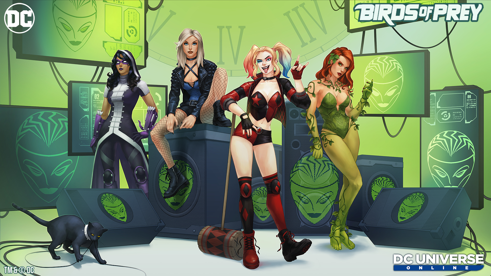
Episode 37: Birds of Prey Final Key Art
Looking at this completed and now out there for everyone to see, where does your artist's eye go when you look at it? Walk us through the piece.
Harley is our bright, center of the piece – I think she definitely has the loudest personality and probably the goofiest, so by personality contrast and literal contrast, she stands out the most.
I wanted everyone to have their personality show through in their pose and placement. Poison Ivy is our femme fatale seductress, Black Canary is cool and badass, and Huntress is a little grumpy about being thrown into the girl gang, so she’s hanging in the back but also still here to be part of the group.
Oracle’s role is less front-line punchy, so I have her represented through her persona and the monitors. We weren’t confident that Catwoman could fit into this particular composition, and throwing Isis (the kitty) in created an opportunity for some humor.
Are there certain elements or choices that stand out to you as an artist that an average looker-at-art like me probably wouldn't directly notice or have the vocabulary for?
From a technical standpoint, it was interesting to separate the DC characters from the background since there is a lot going on. Then, I had to get them to read separately from the speakers themselves. There was a balancing act of keeping an appropriate visual hierarchy (which means my focal point is the characters, secondary is the background, and Isis is my third read).
Harley is very light and dark so by value contrast she naturally stands out the most. The background is relatively low contrast to not take focus away from them. There is also a vignette effect, which means I have the edges of the picture darker to guide your eye towards the center.
Are there any elements that surprised you or ended up very different than you expected by the end?
I did all the characters separately and first, which I’m not sure was the best solution to putting this piece together. The most difficult part of this was trying to get everyone to look cohesive and in the same space.
A couple of my sketches had Black Canary as a ginormous, giant woman since it is a little harder for me to tell proportions when someone is sitting, and I think I had to shrink Poison Ivy down a couple times. Harley also had some leg surgeries throughout the process. It happens!
I haven’t done very many pieces with multiple DC characters so this was an interesting learning experience. I’m definitely going to ask other artists what they would’ve done differently!
Finally, just in your own response looking at this art finished, what comes up? is there something you are most proud of here?
It means a lot to me that the team was so supportive of going this route with full illustration and just how excited about this project everyone was the whole way. And now I’m geeking out seeing the Birds of Prey art on sites like PlayStation’s Twitter. SO COOL!
One more big thank-you to Megan for taking the time to walk us through key art today. We hope you have enjoyed the little look behind the scenes.
If you have questions for Megan, she will be able to answer some of them over on the official DCUO forums, or you can find her on Twitter @megillakitty.
And remember, Birds of Prey launches April 16, 2020, on PlayStation 4, PC, Xbox One, and Nintendo Switch. Check back for more inside looks soon!